Drawing for a small moving window
Flash artists designed for a rectangle that might appear inside any webpage, on any monitor, beside any surrounding clutter. Their images had to become readable quickly. Thick outlines separated characters from backgrounds. Flat colors survived compression. Oversized gestures communicated emotion without detailed facial animation. A raised arm, tilted body, or stretched mouth could explain an entire reaction.
These choices were practical, but practicality became style. The same bold shapes that reduced file size also gave games an unmistakable presence. Characters looked designed to move rather than to be admired as still illustrations. Buttons, scenery, and props shared the same visual grammar, allowing the whole stage to feel authored by one hand. Even crude drawings could feel coherent when every element obeyed the same confident exaggeration.
Vectors encouraged elastic worlds
Vector artwork described shapes mathematically, allowing them to scale, rotate, and transform without storing a separate image for every size. This made elasticity natural. Limbs could stretch. Symbols could burst outward. A menu icon could bounce into place. Motion did not need to imitate physical reality when shapes were so easy to manipulate.
The result was a form of cartooning closely matched to interaction. A click could squash a button. Damage could send a character spinning. Speed could distort a body into a streak. These reactions made input feel visible. The player did not merely know the game had registered an action; the entire drawing seemed to respond. Animation became feedback with a sense of humor.
Limited frames demanded strong poses
Small productions could not animate every transition with cinematic smoothness. Artists needed poses that carried meaning by themselves. An anticipation crouch announced a jump. A sharply angled silhouette sold impact. A held expression gave the player time to read a joke. Fewer frames placed greater responsibility on each drawing.
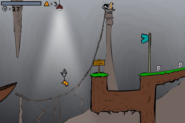
This economy often produced memorable movement. Fancy Pants runs with a loose confidence recognizable from a single screenshot. Henry Stickmin can shift from heroic determination to helpless panic through tiny changes in line and posture. Animator battles transform simple figures into performers because timing and pose supply the detail that anatomy omits. The drawings work because they prioritize intention over realism.
Color palettes carried practical memory too. A limited set of hues made scenes cheaper to produce and easier to revise, but repetition gave each world a signature temperature. Toxic greens, candy pinks, dusty browns, and electric blues announced genre before a title appeared. When those colors return on a modern screen, they recover atmosphere faster than a detailed reconstruction could.
Backgrounds solved a different problem. They needed enough detail to suggest place without competing with hazards, platforms, or clickable objects. Designers used gradients, repeated symbols, silhouettes, and broad planes to separate action from atmosphere. The strongest scenes guided the eye invisibly: decoration framed the route, contrast identified danger, and empty space gave moving characters room to remain readable. That balance made modest rooms feel intentional, giving players a stage while preserving the illusion of somewhere larger.
Interfaces had accents
Flash games rarely hid their menus behind neutral design systems. Interfaces shared the attitude of the game. Horror titles used distressed lettering and reluctant transitions. Comedy games placed jokes in button labels. Arcade games made score counters and play buttons part of the spectacle. Typography could wobble, glow, arrive noisily, or appear hand-lettered because text lived on the same stage as every other object.
This gave interfaces an accent. Players could recognize a creator’s sensibility before play began. A loading screen might contain a tiny animation, a sarcastic instruction, or a logo assembled with unnecessary drama. These moments were not always efficient, but they established tone. The menu promised what kind of personality would govern the rules.
Imperfection revealed the maker
Professional consistency is useful, yet it can remove evidence of process. Flash games often retained uneven lines, mismatched proportions, improvised textures, and awkward transitions. Those imperfections made the route from idea to artifact easier to imagine. Players could sense that somebody had drawn, tested, revised, and finally decided the work was ready enough to share.
This visibility inspired other creators. A polished console game might feel unreachable, while a browser game made with recognizable tools suggested a possible next step. Players traced characters, opened animation software, copied effects, and built experiments of their own. The aesthetic did not only communicate a finished world. It quietly demonstrated that worlds could be made.
The thumbnail as compressed theatre
Before a game could show its animation, a thumbnail had to earn the click. Artists compressed conflict into one image: a character leaning into action, an enemy approaching, a vehicle airborne, or a logo exploding across the frame. Accuracy mattered less than energy. The thumbnail represented the feeling the game hoped to deliver.
At small sizes, contrast became essential. Bright figures sat against dark fields. White outlines protected logos from busy backgrounds. Faces grew larger than their in-game versions. This visual salesmanship created its own archive of miniature posters. Viewed together, the thumbnails reveal trends, ambitions, and the intense competition for attention on crowded portals.
Style after the technology
Flash ended as a browser standard, but its visual language did not disappear. Mobile games, web animation, independent cartoons, and modern retro projects continue to use bold vectors, elastic transitions, stick figures, and aggressively expressive interfaces. These choices now evoke a period, yet they remain useful because they were built around clarity and response.
Imitating the surface is easy. Add scanlines, thick outlines, a loading bar, and a bouncing button. Recovering the spirit is harder. The strongest Flash art used constraint to make a specific idea clearer. Decoration served motion, comedy, danger, or feedback. Nostalgia works best when contemporary creators understand that purpose instead of collecting symbols.
The lasting personality of Flash art comes from the closeness between drawing and behavior. Shapes were designed to react, text was allowed to perform, and menus belonged to the same imaginative world as characters. The technology offered a stage, but artists decided how loudly, strangely, or gracefully it would move. Their work survives because personality was never an extra layer. It was built into every line that waited for the player to click.