The homepage had an opinion
An old game portal did not greet every visitor with a private prediction. It displayed one homepage assembled for everyone: featured releases, popular titles, recent uploads, genre links, and perhaps a banner announcing an editor’s choice. The arrangement communicated taste before the player clicked anything.
That taste could be inconsistent, commercial, or mysterious. A sponsored game might occupy the largest space, while a strange puzzle appeared in a small sidebar. Yet the page still felt authored. Someone had decided what deserved the front door today.
Featured space created an event
A prominent placement could transform an unfamiliar game into a shared release. Large artwork, a “new” badge, and a short description concentrated attention. Players who arrived without a plan were given one.
The featured slot also framed expectation. If a portal selected a game as exceptional, visitors approached it with patience and curiosity. They might tolerate a longer loading screen or unfamiliar mechanic because the page had already offered a recommendation.
Genre shelves encouraged wandering
Action, puzzle, sports, racing, strategy, adventure: portal categories were blunt, but they offered understandable routes through abundance. A player could enter with a mood rather than a title and browse a shelf until one thumbnail created curiosity.
The categories also produced productive mistakes. A game labeled “action” might behave like a physics puzzle. An “adventure” could be mostly dialogue. Loose classification exposed players to hybrids because the shelves could not perfectly contain what creators made.
Browsing was spatial in a conceptual sense. Players moved from homepage to category, from category to game, and from that page to a list of related titles. They developed mental maps of the portal, remembering where certain kinds of experiences tended to hide.
Thumbnails made tiny promises
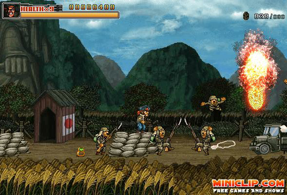
A portal catalog compressed entire games into images small enough to scan quickly. The thumbnail might show a character, dramatic obstacle, menu logo, or chaotic action scene. Its job was not to explain the game fully; it needed to make one useful promise.
Players became fluent in reading these promises. Hand-drawn art suggested one tone, glossy gradients another. A screenshot dense with interface elements implied management or strategy. A lone figure on a platform announced a familiar kind of movement.
Misleading thumbnails were part of the education. An exciting image could conceal a weak game, while an awkward picture could guard something remarkable. Over time, players learned which visual cues to trust and when to click against their own expectations.
Ratings turned audiences into editors
Stars, scores, play counts, and comments added collective judgment to the portal’s official arrangement. A modestly featured game with an unusually high rating could pull attention sideways. Players used the crowd to challenge or confirm the homepage.
These systems were imperfect. Early votes could dominate, popular genres attracted larger audiences, and some users rated from frustration or fandom. A numerical average compressed different preferences into false precision.
Still, participation mattered. Players were not only consuming a catalog; they helped order it for those arriving later. A recommendation emerged from thousands of small reactions, visible as a score attached to a public page rather than hidden inside a personalized model.
Editors built a voice over time
The strongest portals developed recognizable taste. Their selections, descriptions, badges, and seasonal collections formed an editorial personality. Visitors learned that one site favored polished arcade games while another welcomed experimental animation, difficult puzzles, or community-made oddities.
Trust accumulated through repeated encounters. A player clicked an unfamiliar recommendation, enjoyed it, and returned willing to take another chance. The portal became more than storage. It was a guide whose preferences could be understood, questioned, and occasionally forgiven.
Editorial voice also gave context to abundance. A collection titled around winter, local multiplayer, or five-minute distractions created meaning through adjacency.
Discovery remained partly accidental
Portal navigation did not always know enough to be efficient. Related-game lists relied on broad tags. Search terms missed unusual titles. Pages ended with links selected through simple rules or manual judgment. The resulting path could be messy.
That mess made room for accidental discovery. A player seeking a racing game might notice a surreal point-and-click adventure beside it. Curiosity could override the original plan because the site had not optimized every visible choice around a predicted identity.
Accident is difficult to manufacture once personalization becomes precise. A system that learns preferences can serve more reliable matches, but reliability may narrow surprise. Portals often produced discovery by exposing everyone to the same imperfect assortment and allowing attention to wander.
The page remembered the crowd
A public chart created a snapshot of collective activity. Most-played lists, weekly favorites, and recent comments showed what other visitors were doing. Even without live multiplayer, the portal felt occupied.
Trends changed slowly enough to notice. A new title climbed the rankings, an old favorite refused to leave, or a seasonal game returned each year. The list became a lightweight history of shared attention.
Because rankings were visible and common, they encouraged conversation. Players could argue that the number-one game was overrated or campaign for a neglected favorite. The catalog was not a private stream disappearing beneath each individual. It was a public wall that people could point toward together.
Curation left fingerprints
Modern recommendation systems can surface extraordinary work from enormous libraries. Personalization is not the enemy of discovery. The difference is that algorithmic judgment often hides its reasoning, while an old portal’s structure displayed many of its choices directly.
A featured badge, genre page, score, and staff collection each announced a different source of authority. Players could decide whether to trust the editor, the crowd, the category, or their own response to a thumbnail. Discovery involved reading the catalog as well as selecting from it.
Those visible layers gave portals distinct identities. Two sites hosting the same game could feel unlike each other because the surrounding recommendations changed its neighborhood. Curation was an atmosphere produced by sequence, emphasis, language, and omission.
Before algorithms knew the player, portals asked the player to know them. Their homepages repeated habits, revealed biases, and offered communal routes through disorder. The next favorite game might come from the largest banner or the smallest overlooked square, but either way, someone had left it where wandering eyes could find it.